Teatro Verdi
May 2020
Identity
Florence, Italy
Typefaces: Big Caslon FB by Matthew Carter and TeX Gyre Heros by Boguslaw Jackowski

Prompt
Rebrand and create a visual identity system for Florence Italy’s historic Teatro Verdi.
Rebrand and create a visual identity system for Florence Italy’s historic Teatro Verdi.
Key Insight
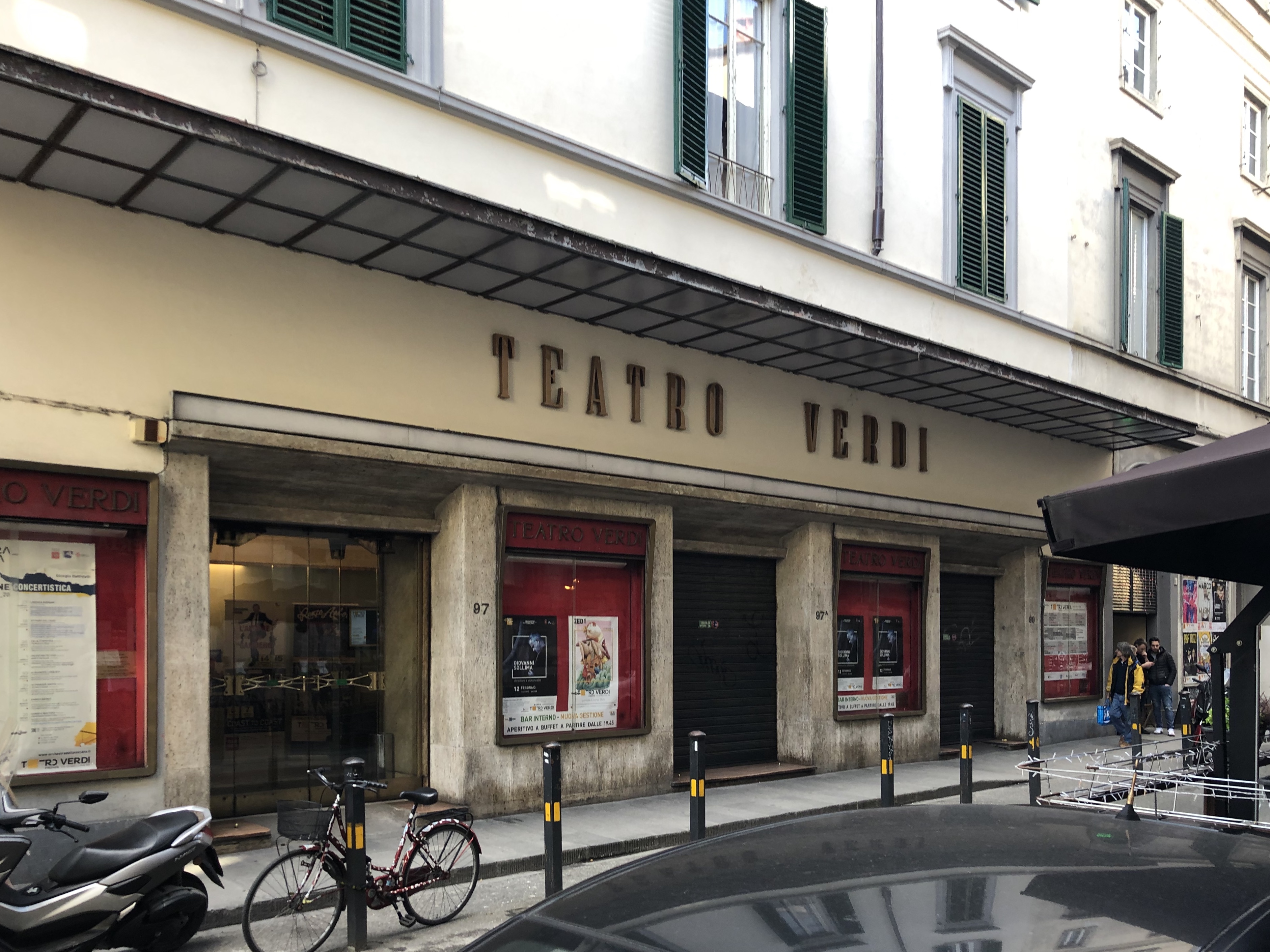
Teatro Verdi’s theater style is denoted by it’s proscenium (the metaphorical vertical plane of space in a theatre). But a theater is incomplete without a an audience to connect with that stage. Additionally, the namesake of the theater, Guiseppe Verdi, was pivotal in the Italian unification movement. Coming together is a theme throughout the theater’s history.
Teatro Verdi’s theater style is denoted by it’s proscenium (the metaphorical vertical plane of space in a theatre). But a theater is incomplete without a an audience to connect with that stage. Additionally, the namesake of the theater, Guiseppe Verdi, was pivotal in the Italian unification movement. Coming together is a theme throughout the theater’s history.
Solution
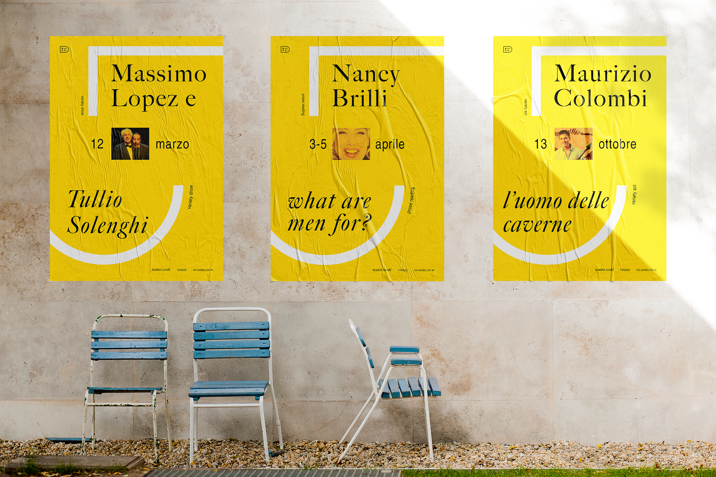
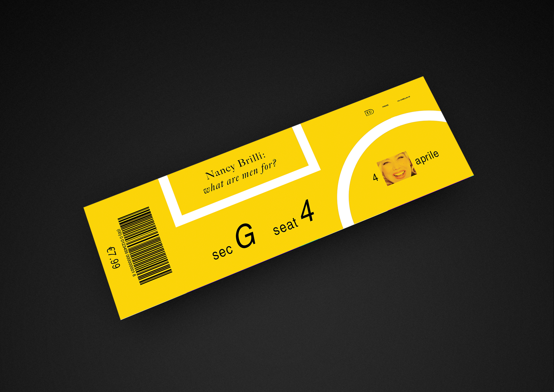
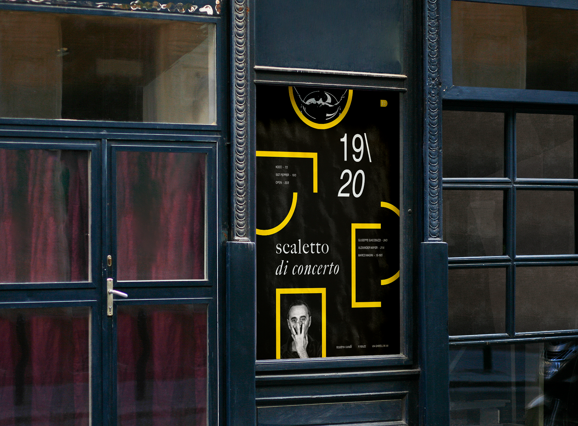
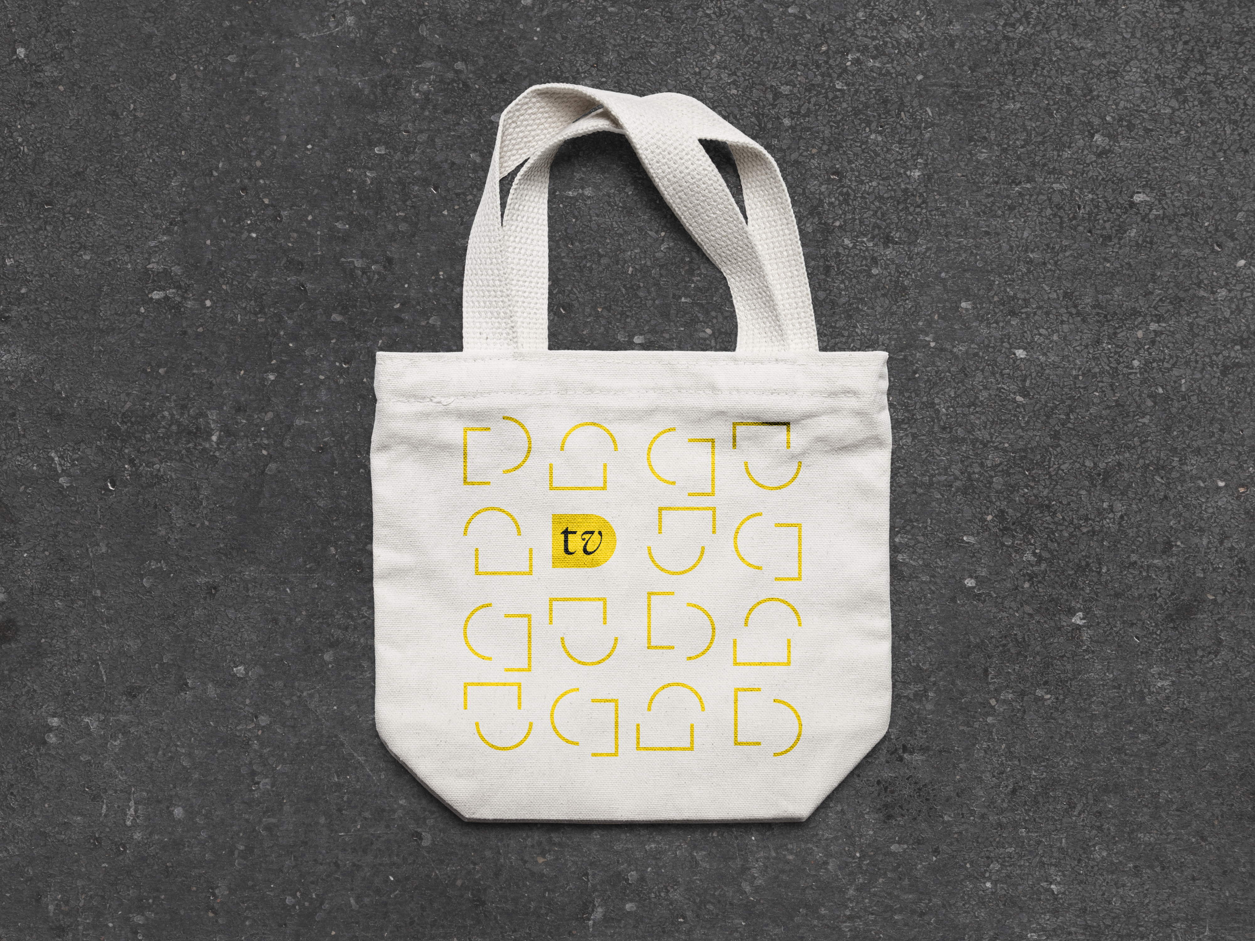
The main components of the visual system are the round and squared bracket, signifying the stage and audience. The formal iterations with the full name show the metaphorical plane of the proscenium, while the monogram “tv” brings the two together as Teatro Verdi aims to do with its electrifying shows. Furthermore the unification of the brackets alludes to Giuseppe Verdi’s work as an activist.
The main components of the visual system are the round and squared bracket, signifying the stage and audience. The formal iterations with the full name show the metaphorical plane of the proscenium, while the monogram “tv” brings the two together as Teatro Verdi aims to do with its electrifying shows. Furthermore the unification of the brackets alludes to Giuseppe Verdi’s work as an activist.
Research + Synthesis
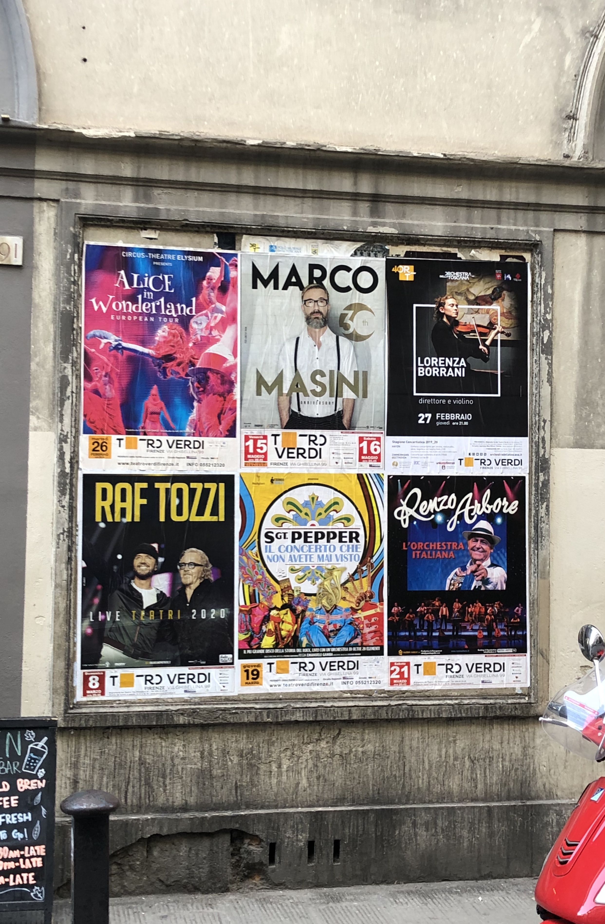
I began by visiting the theater, researching its historical and contemporary involvements, and the visual identities of other European cultural institutions. I broke this research into three main findings that I guided my design decisions going forward: Teatro Verdi is the oldest Italian Style Theater in Tuscany, Giuseppe Verdi was key in the Italian Unification movment, and competitors mainly use modern, geometric sans serif typefaces and minimal color.

Ideation + Iteration
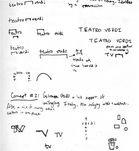

With these main principles in mind, I started ideating on ways to incorporate them into the visual representation. I began by sketching out all of the ideas that I had, and selecting my favorite three to build out in a vector format. On the left you can see one page (of many) of my idea thumbnailing, followed by the three iterations that I built out.
Prototyping + Testing
Having selected an iteration to carry forward, I began testing it out in various mockups to evaluate its viability as an identity system. As I developed prototypes, I found more rigid rules and themes to carry out between the different applications of the identity. On the right is an example of the testing and iteration I did just for the calendar poster. I developed many compostions, and then played with color. Along this process of prototyping applications, I would test with classmates for feedback on clarity, hierarchy, and efficacy of concept.
Final Product
Below are the final mockups of the identity system, which look to visually highlight the message of the theater. Whether it be the unification of a nation or an audience with the performers onstage, Teatro Verdi has always been about bringing people together. It is historic and it is bold, just like its signature yellow color. It demands your attention, attendance, and engagement, because the people are what make a theater a theater.