Sam Fox Reservation App
DEC 2020
UI/UX Design, and UX Research
St. Louis, MO
Type: Roboto by Christian Robertson
Prototypes: student and monitor
Problem
Sam Fox students needed a mobile app to reserve studio and workshop spaces. Monitors needed to track student usage of tools and spaces. All of this was needed to make the potential dangerous shops safe and accessible for all students.
Sam Fox students needed a mobile app to reserve studio and workshop spaces. Monitors needed to track student usage of tools and spaces. All of this was needed to make the potential dangerous shops safe and accessible for all students.
Key Insight
Both shop users and monitors identified that the cornerstone of a safe shop environment was a strong sense of community and inclusivity in the space. Breaking down barriers to communication and connection would allow for more transparency, comfort, and eventual usage of the resources at the student’s disposal.
Both shop users and monitors identified that the cornerstone of a safe shop environment was a strong sense of community and inclusivity in the space. Breaking down barriers to communication and connection would allow for more transparency, comfort, and eventual usage of the resources at the student’s disposal.
Solution
An app that was equally robust on the user and monitor side and that connected these two interfaces seamlessly. Providing necessary and relevant information about those in the space would allow everyone to feel more comfortable around one another. Additionally, this will allow students to know who to ask for help, and for the monitors to be best prepared to help those students.
An app that was equally robust on the user and monitor side and that connected these two interfaces seamlessly. Providing necessary and relevant information about those in the space would allow everyone to feel more comfortable around one another. Additionally, this will allow students to know who to ask for help, and for the monitors to be best prepared to help those students.
Research
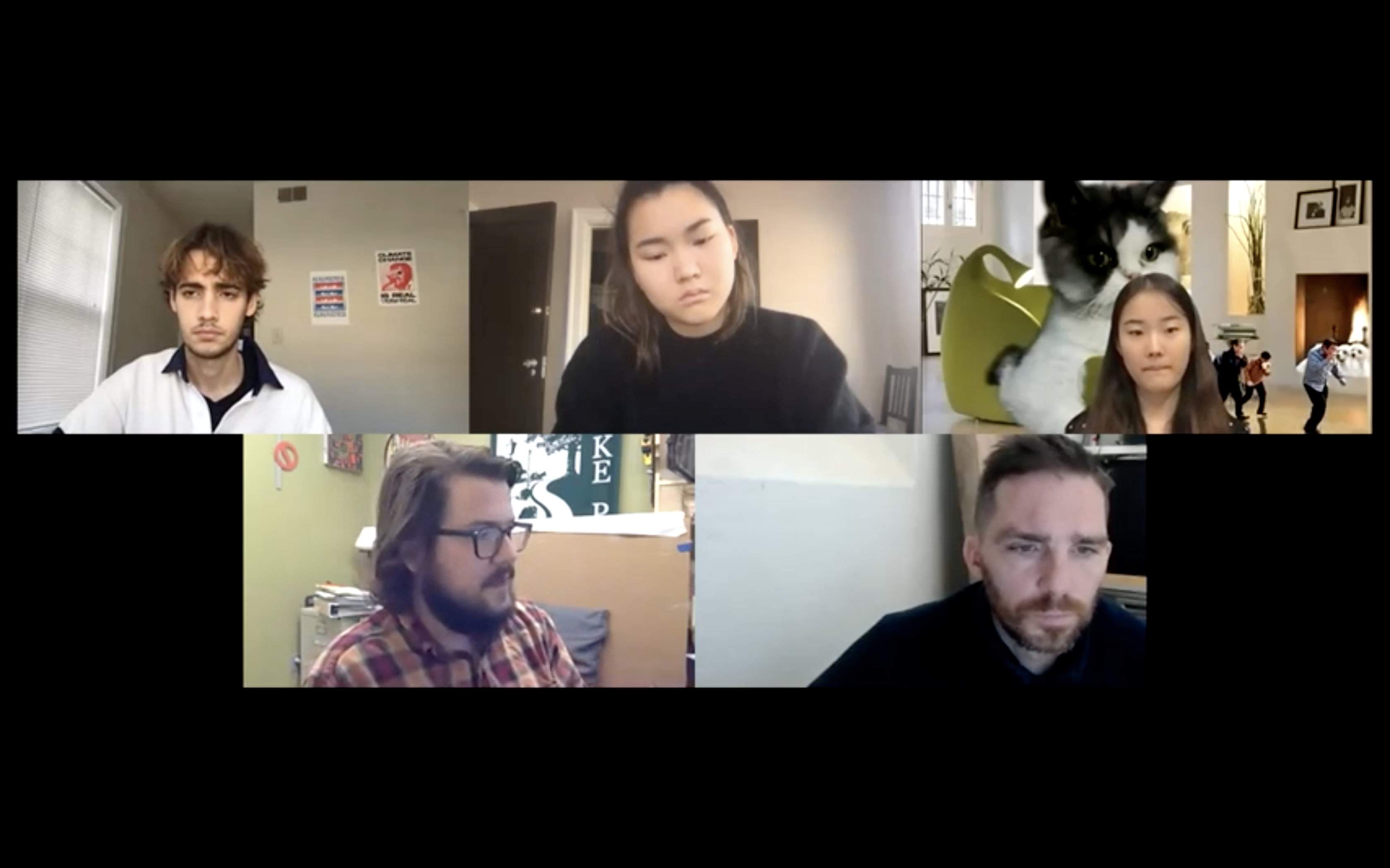
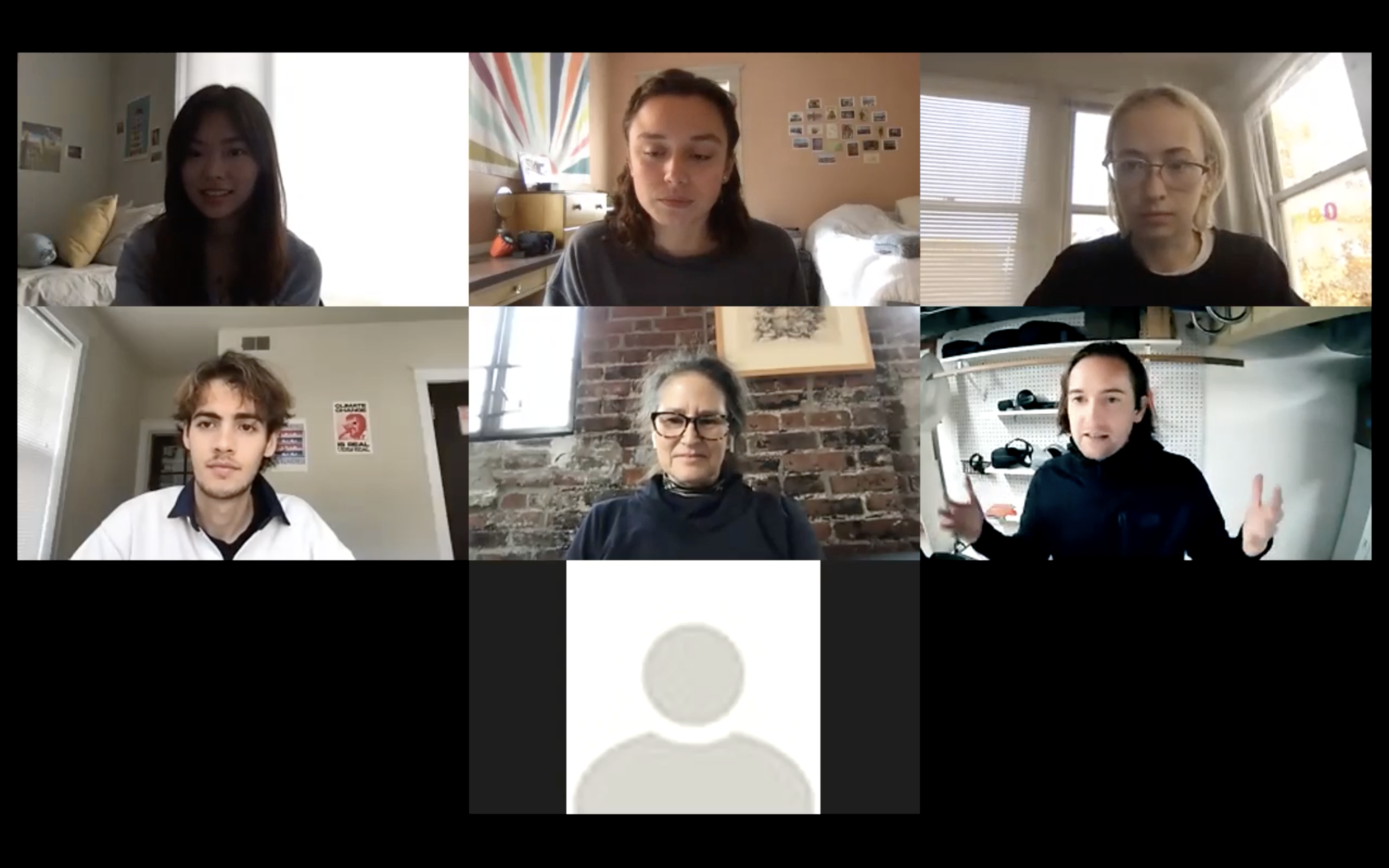
We started our process as a class by doing group user interviews via zoom. We interviewed one shop user and one shop monitor to get a better understanding of the needs of the two main users. Prior to our interviews, we received a presentation on best practices for user interviews from Google designer Molly Needelman.
Synthesis
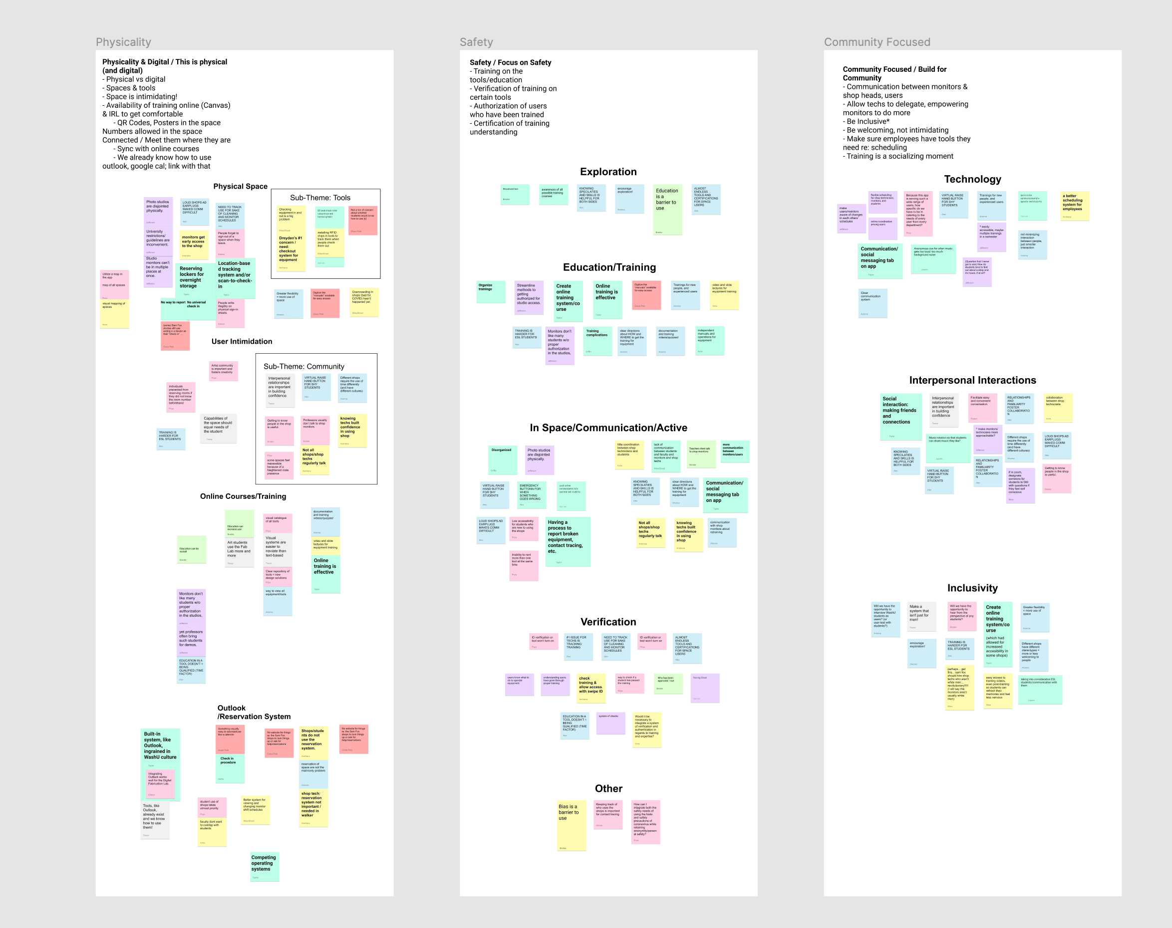
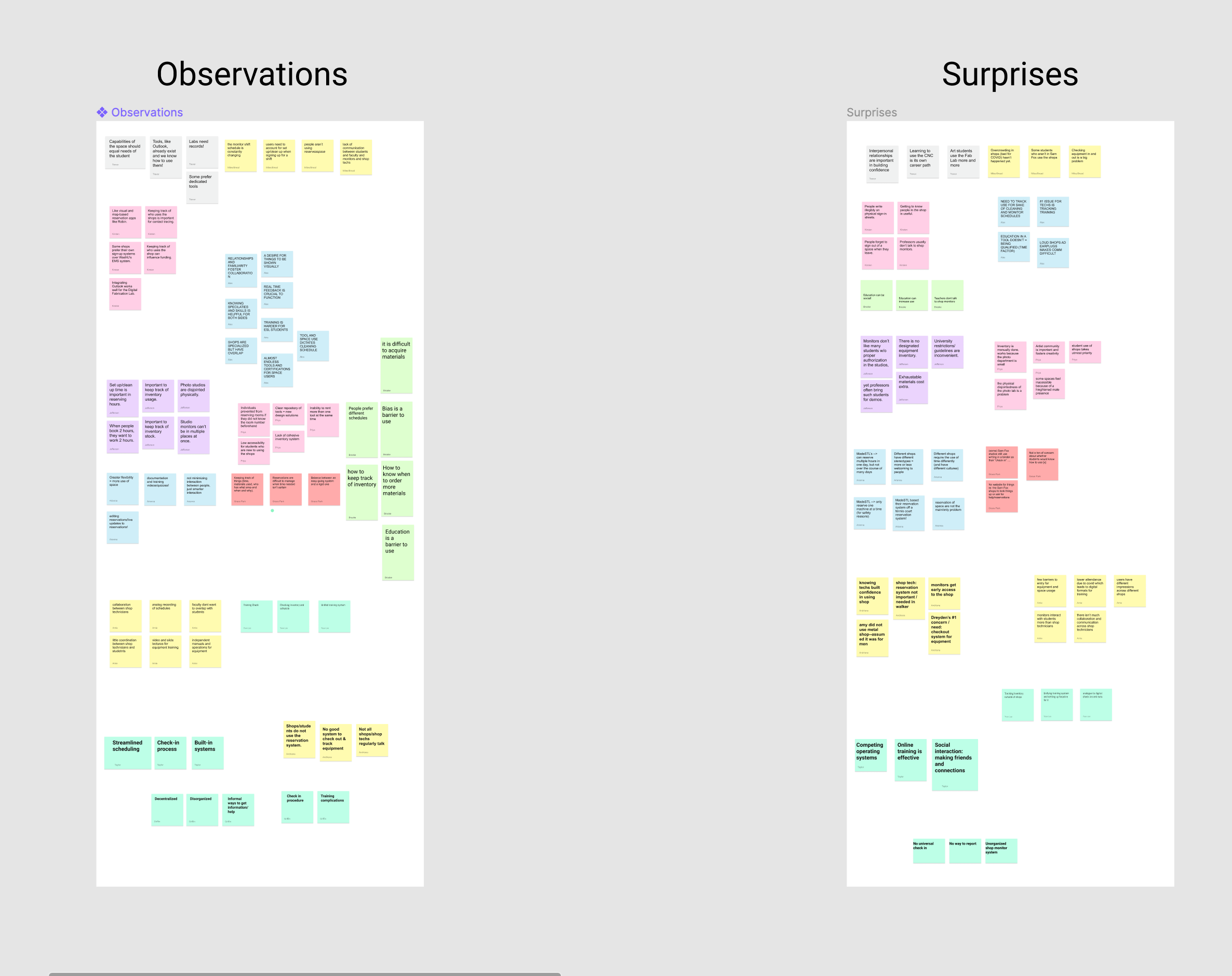
We kept the group collaboration going for the synthesis of our user interviews. We began by writing down some of the key insights we individually picked up on and then grouped them based on similarities. Each of these reoccurring similarities was highlighted as a “theme”, the 5 final ones being: Safety, Community, Physicality, Availability, and Flexibility.
Ideation + Iteration
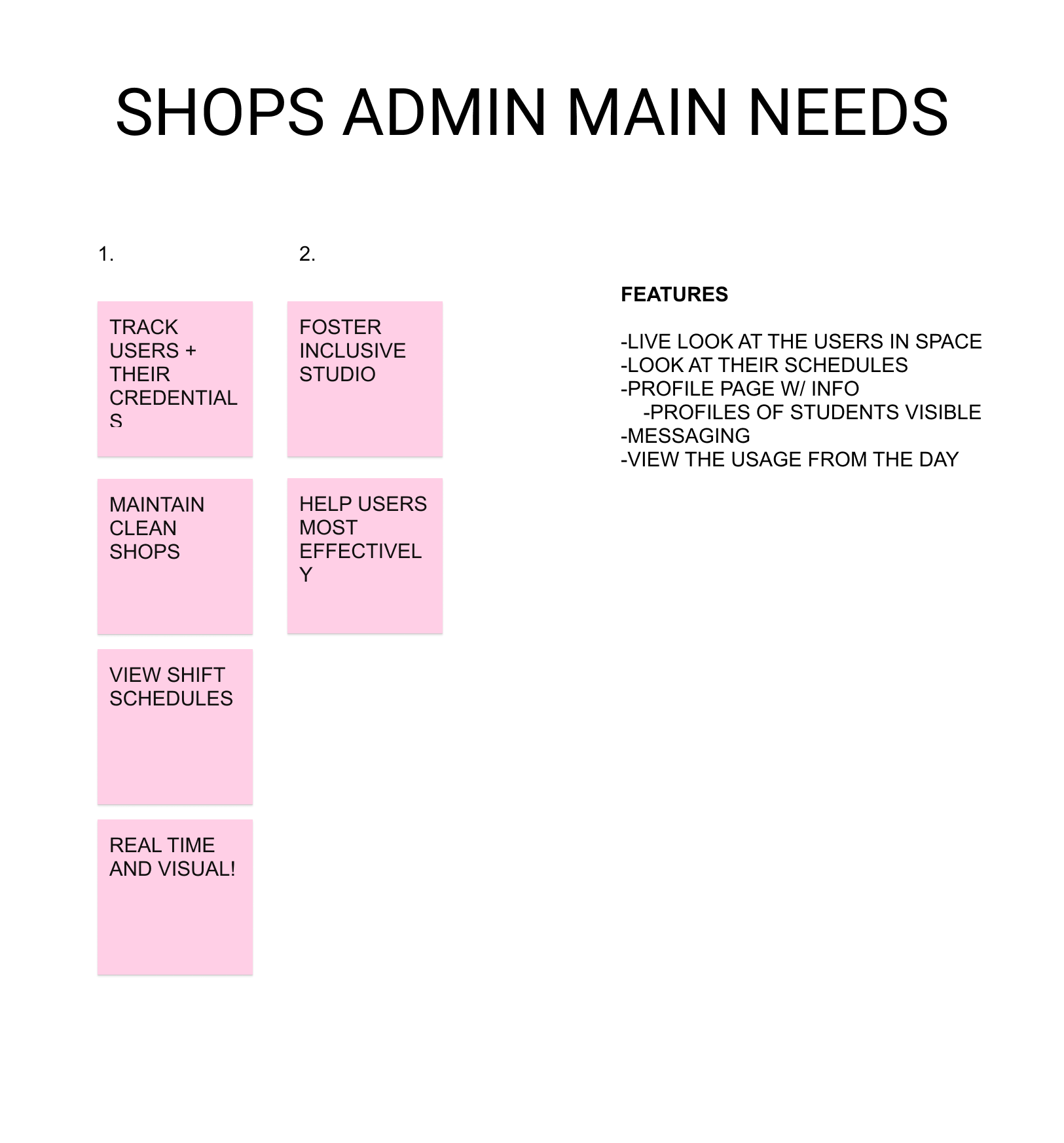
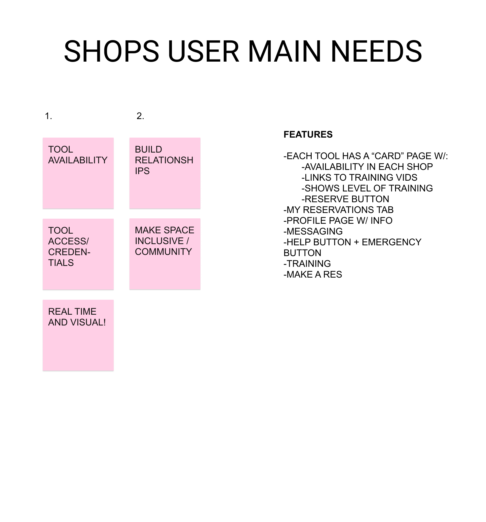
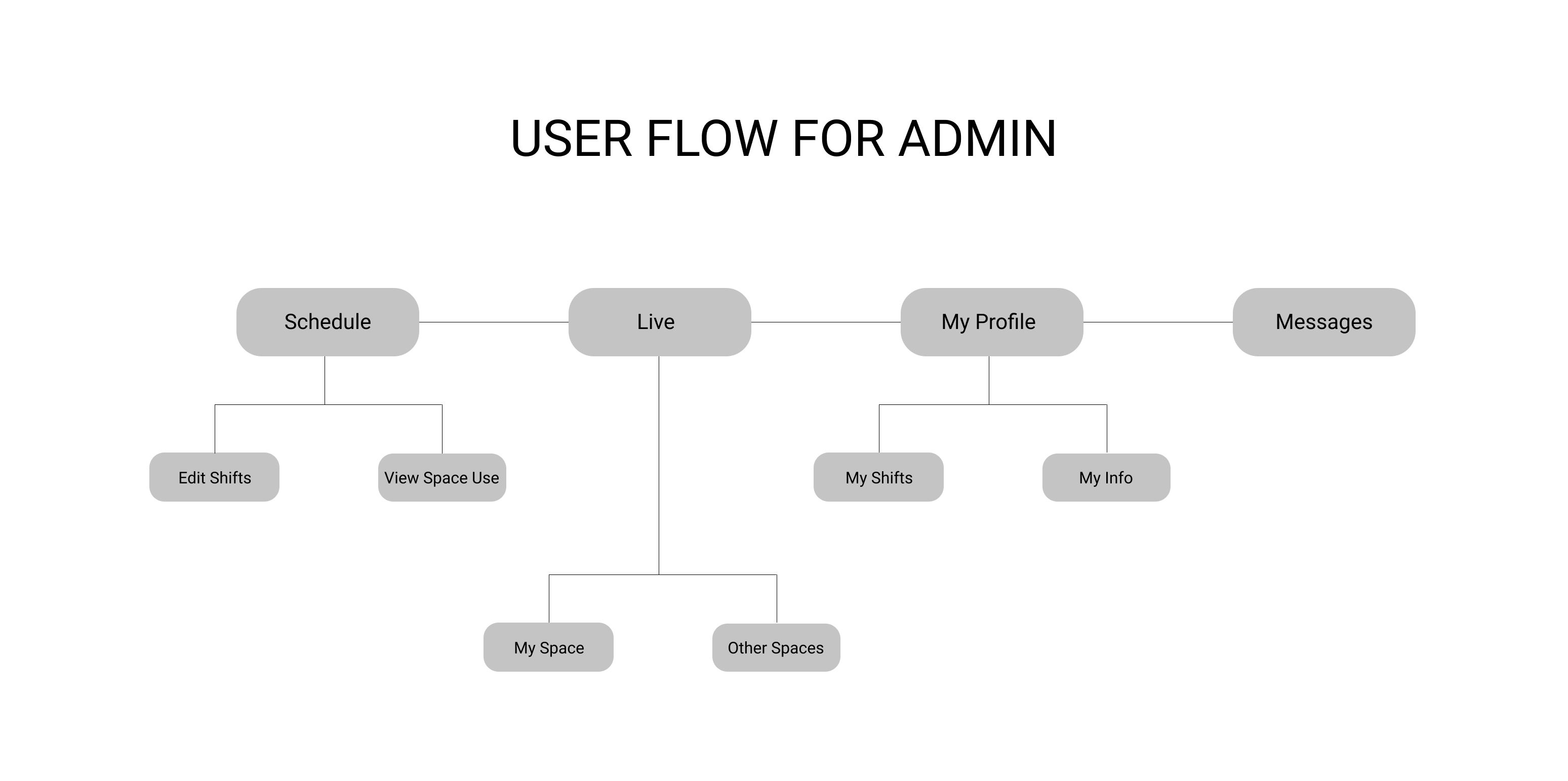
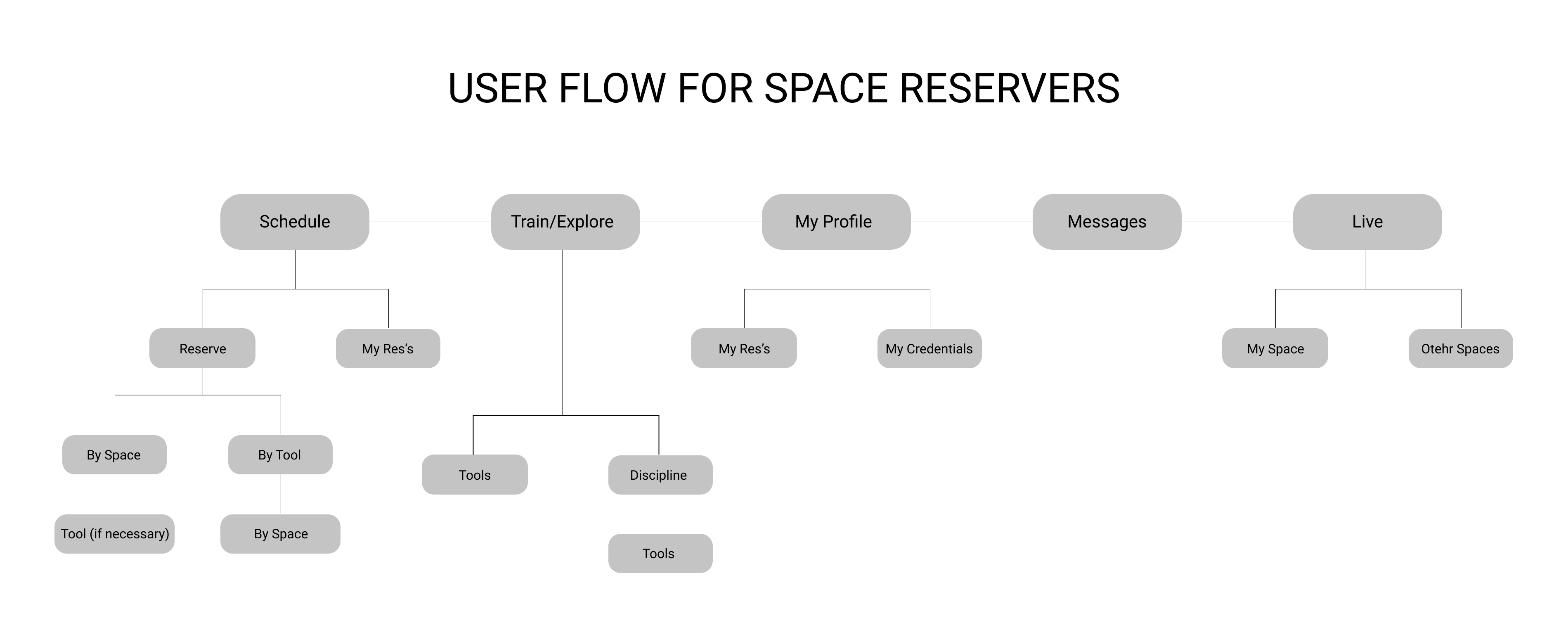
While I wanted to keep all five themes in mind with my design decisions, I focused on Safety and Community as the most important given their relatively higher frequency in the interviews I participated in. I began my feature ideation with a list of main needs taken from interviews and then developed an information architecture for the app with the features that fit well together.
Prototyping + Testing
After building out the underlying structure of my app, I went into prototyping interface options for the final features. With many features, I adapted and changed them after getting user feedback on what was necessary/unnecessary, or helpful/unhelpful. A presentation on Usability Research from a Google UX Designer, allowed me to run think-aloud protocol, pair sampling, and retrospective probing tests on the same users we interviewed in our research phase. The slideshow shows some in-process prototypes I developed of the “Live” feature for the series of tests. We were also tasked to use Google Material Design in our designs, which you will see my understanding evolve through usage.
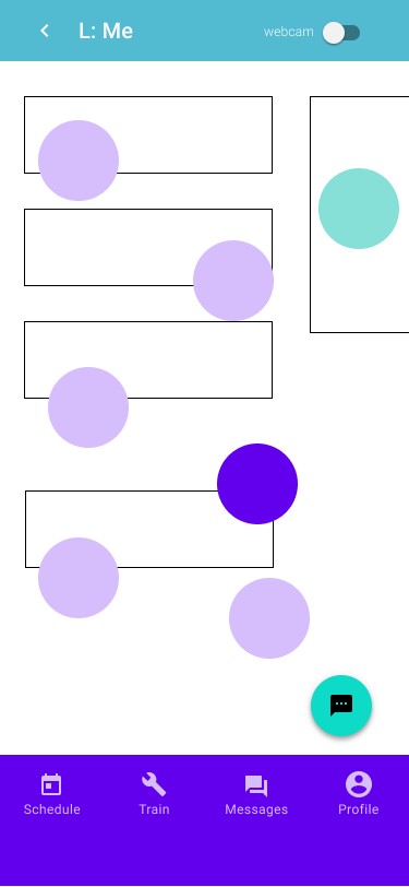
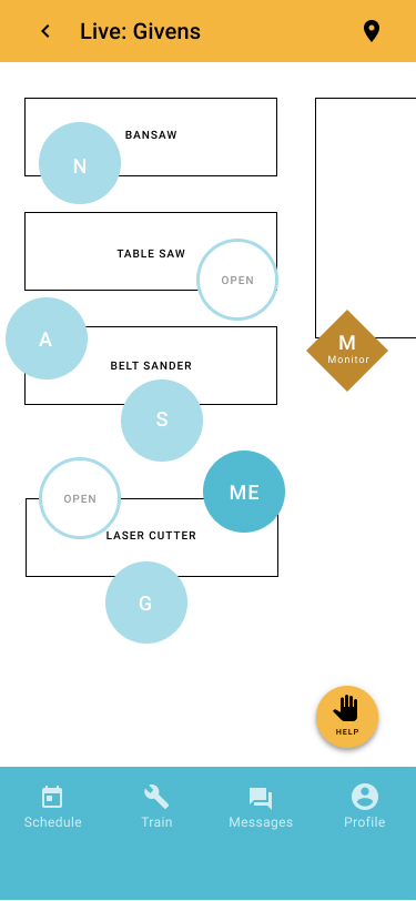
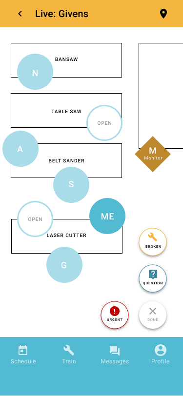
Final Product
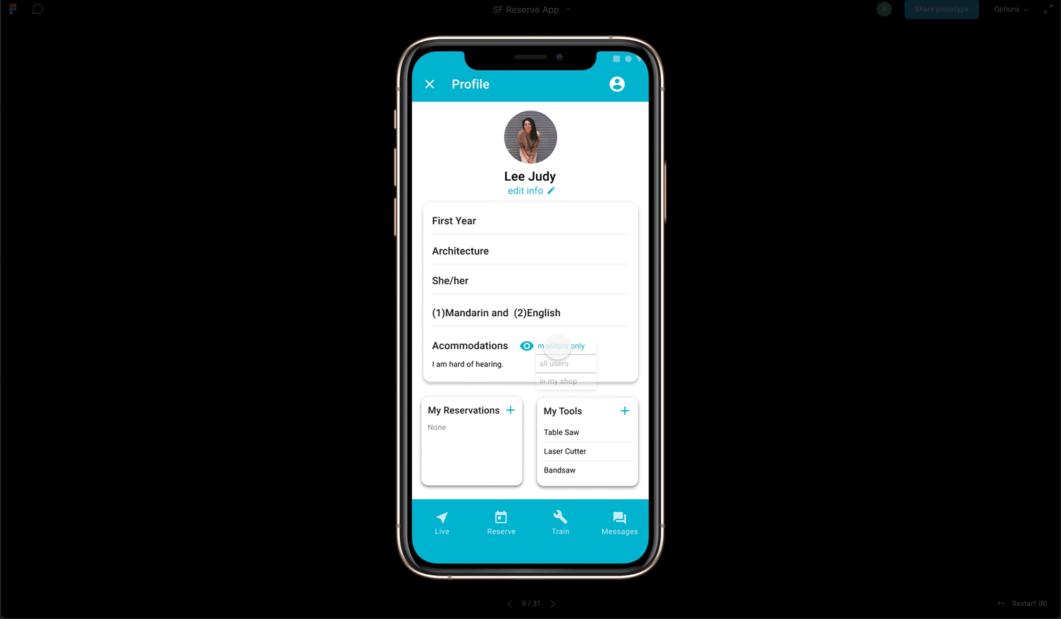
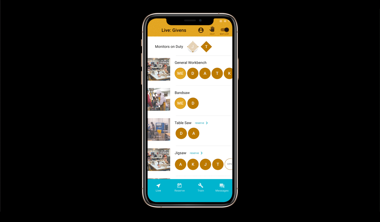
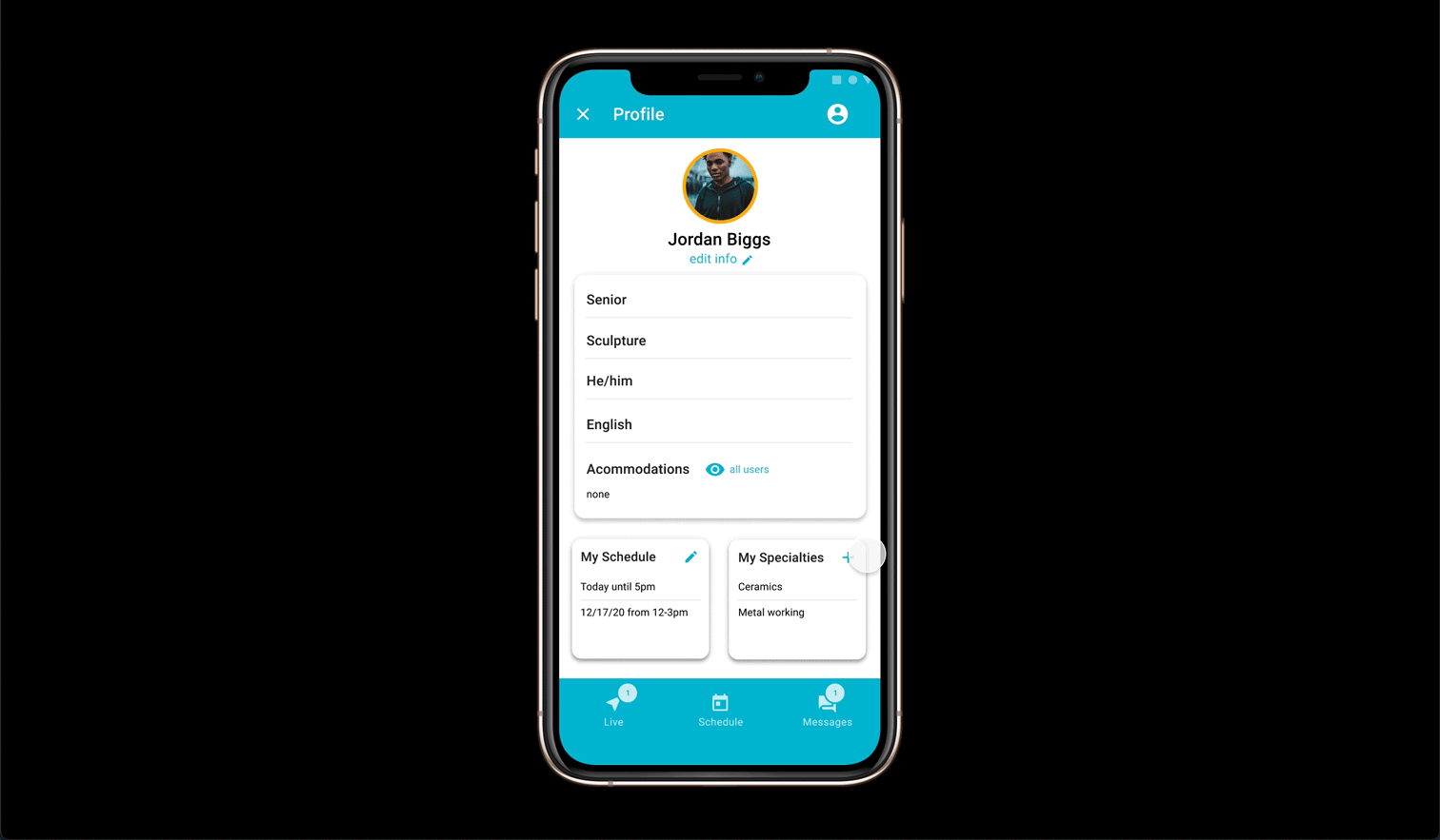
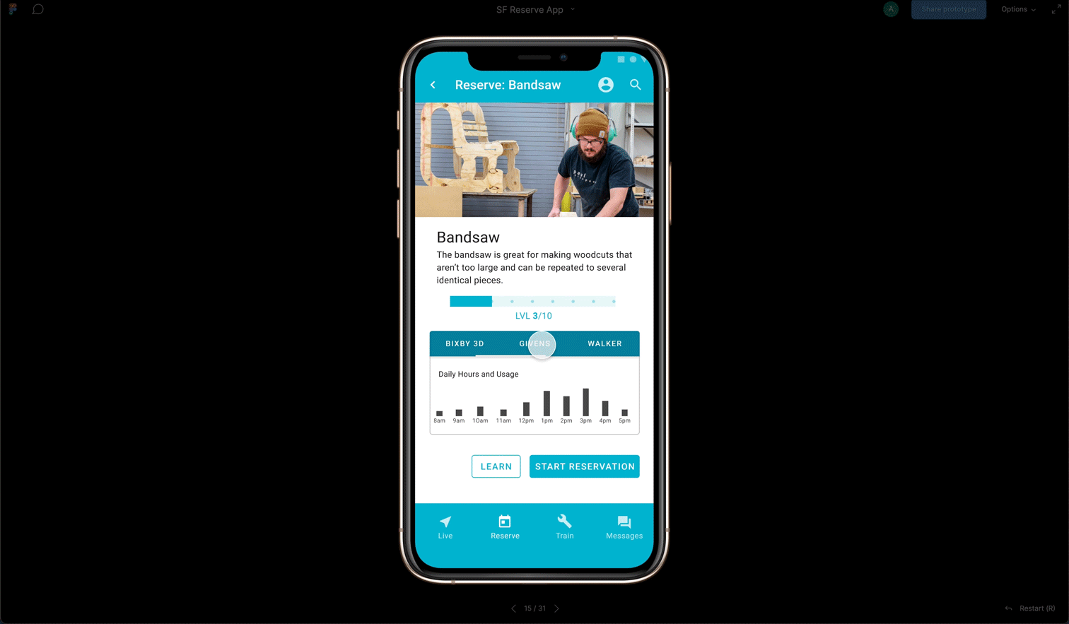
Upon the implementation of user feedback, I was able to build out my full app prototype. These clips show a few short instances of the app’s functionalities. On the left, a tool page, where a student can view what shop spaces have that tool, how busy those shops are, and then reserve the tool in their desired location. Below is an example of how a student can reserve a tool and then ask for help once in the space, and then how that shows up on the monitor’s end. To test out the full capabilities of the app check out the Figma prototypes for the student interface and the monitor interface.