Rotting Well
MAY 2021
UX/UI and Development
St. Louis, MO
Typefaces: Tiny by Velvetyne Type Foundry and Epilogue by Tyler Finck, ETC
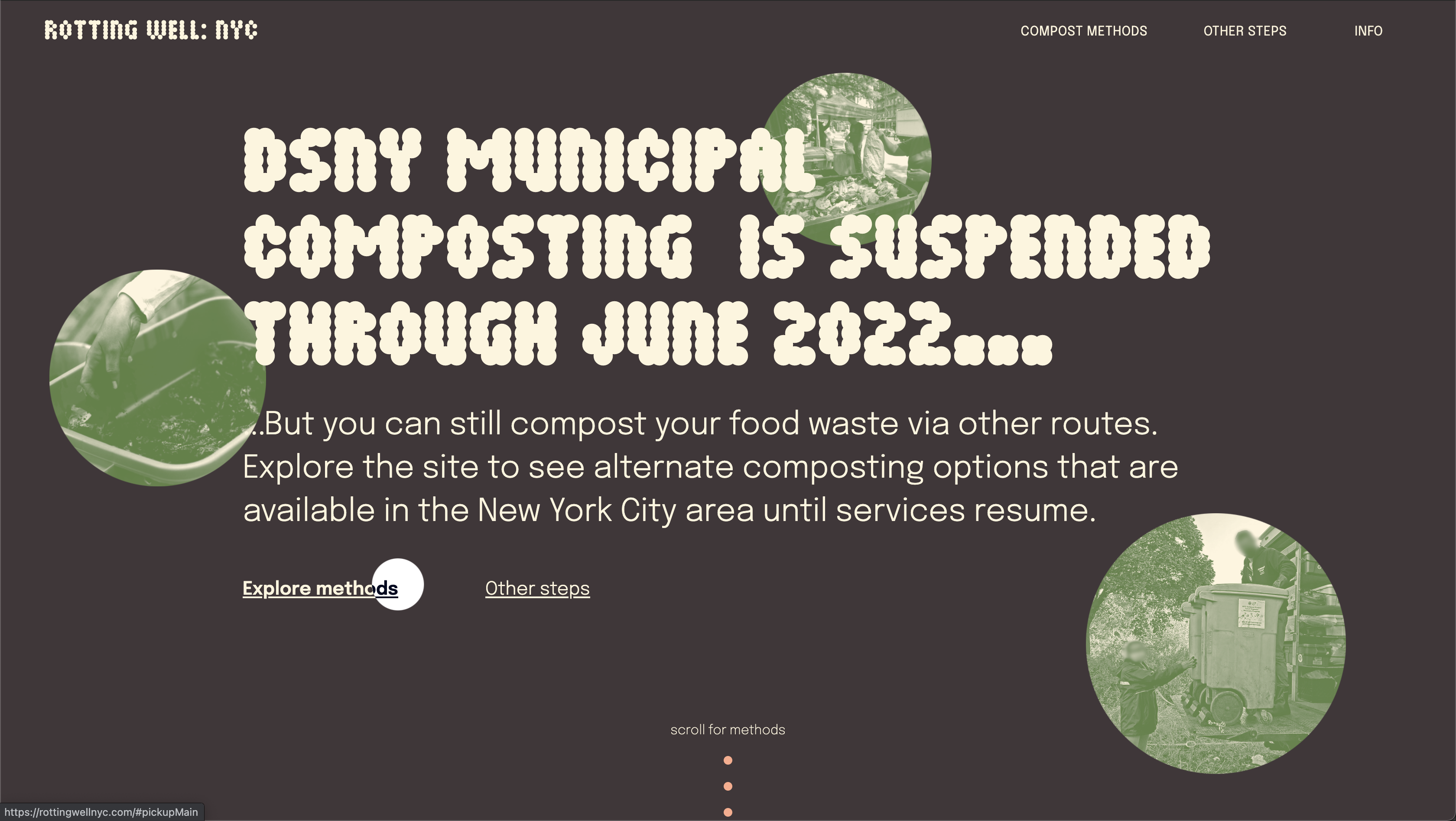
TOPIC: COMPOSTING
For our senior capstone project, we are prompted to generate a project in the media of our choosing on a topic of our choosing. Climate change is one of my largest out-of-class interests, and as it relates to our food system in particular. Composting is crucial to reducing the emissions of improper food waste, a more unknown source of methane gas, and the process seems intimidating. My project is aimed at making proper food waste disposal accessible and approachable to busy, city livers.
RESEARCH
To understand the problem space more in-depth, I had to conduct some primary and secondary research on composting, and specifically in cities. I talked to several recent grads in cities about their composting hesitations and barriers, as well as educating myself on the best ways to compost depending on user resources.
DESIGN JUSTICE

I started reading Design Justice during my winter break and was further introduced in UX Research class this semester. I wanted to ensure that my capstone considered the Design Justice Network Principles to have to most sustainable and equitable impact. In particular, I wanted to explore what resources already exist in this space and attempt to uplift those projects and practices in my final site.
CONTENT STRUCTURING
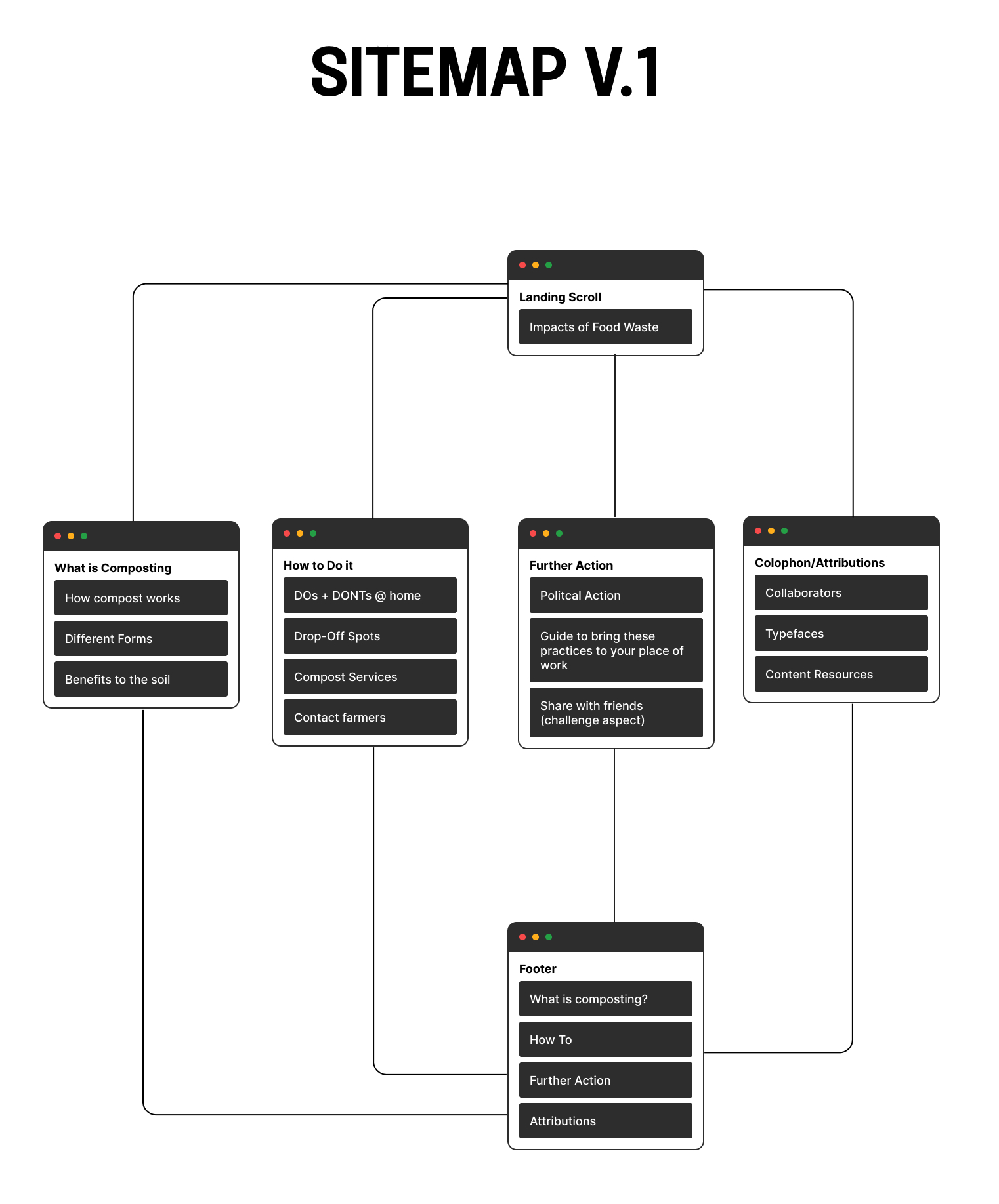
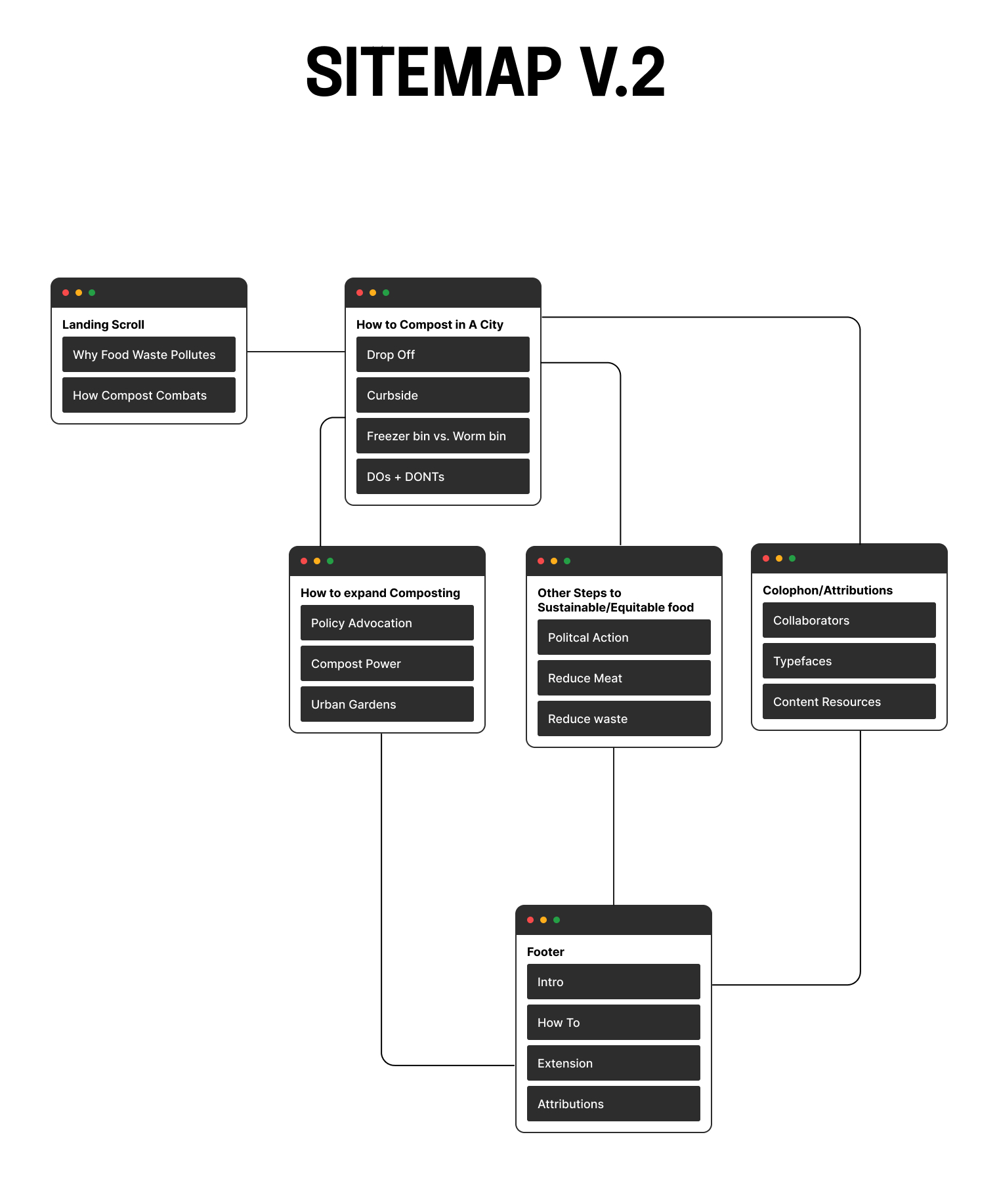
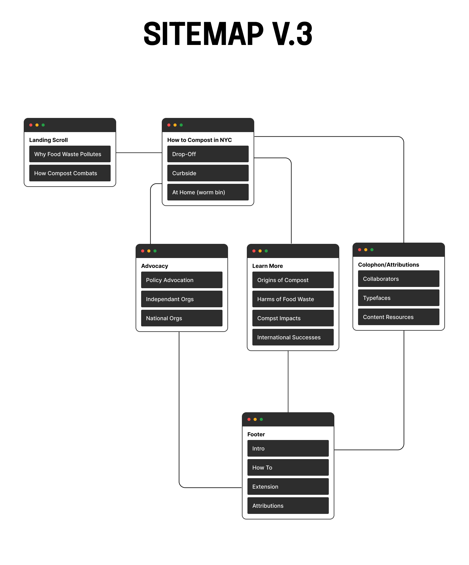
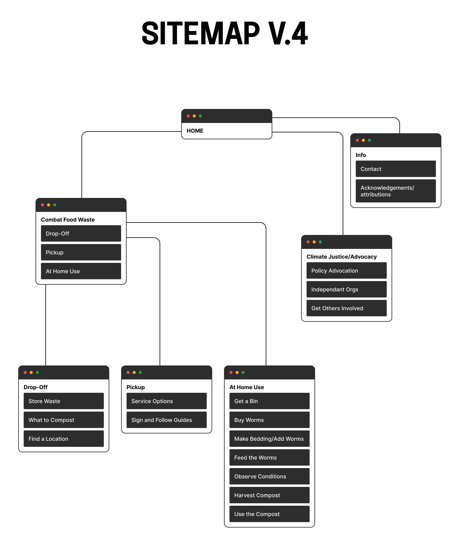
As my topic and content offerings narrowed from the impacts of food waste, to composting in a city, to composting specifically in NYC, my content structure had to adjust. On the right on the four versions of sitemaps I’ve gone through as the topic evolved. V.4 is the final sitemap.
SKETCHING
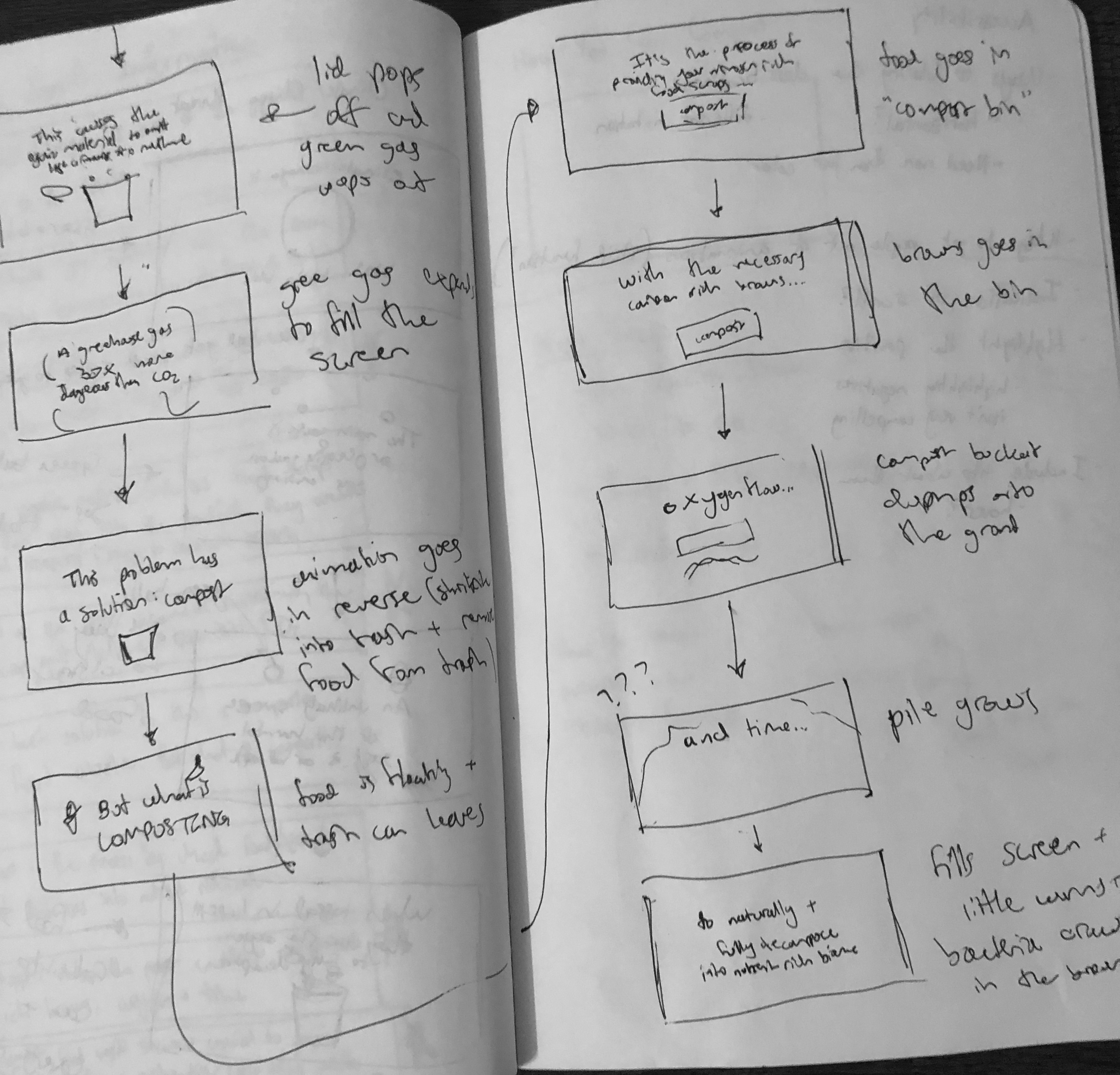
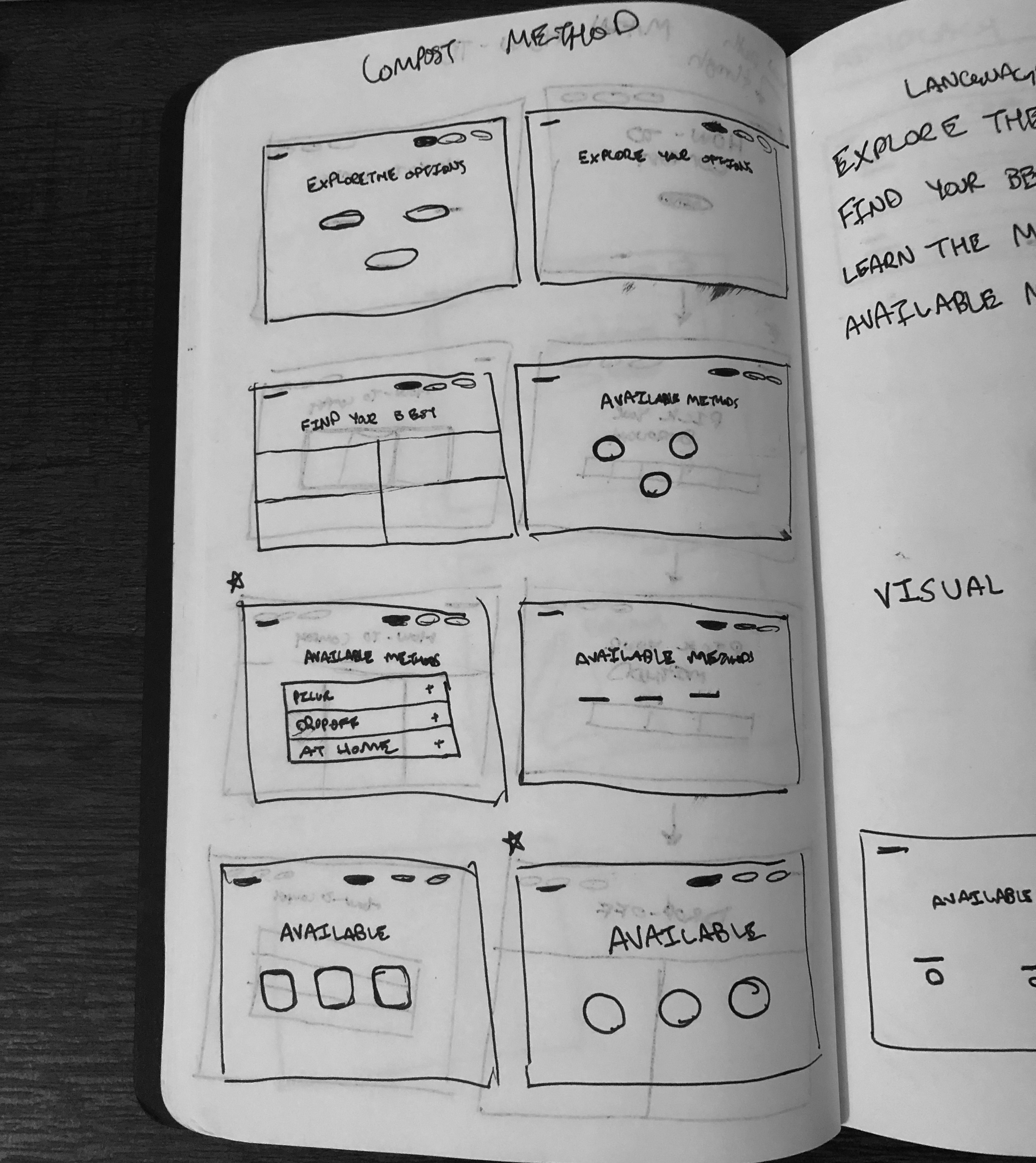
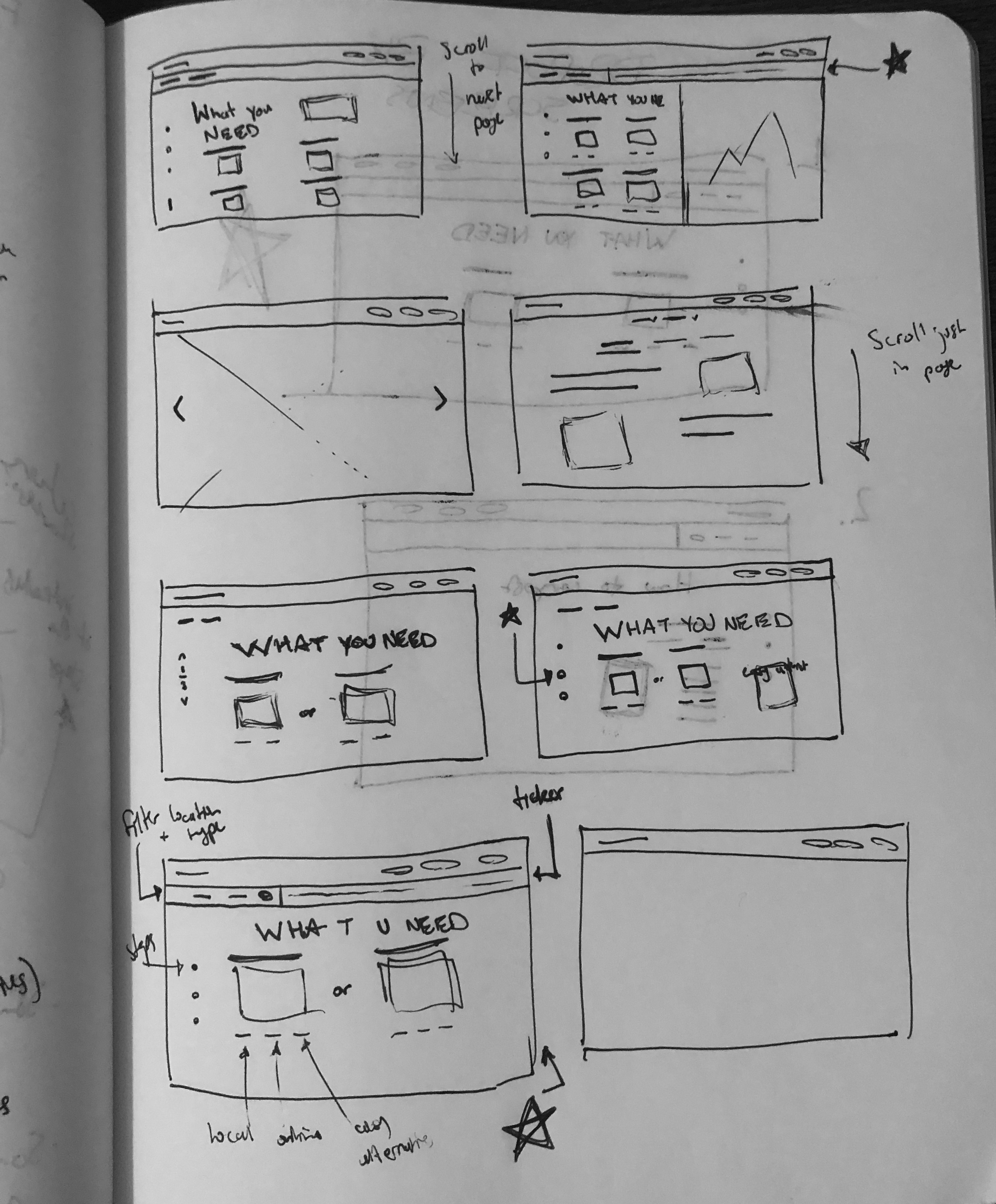
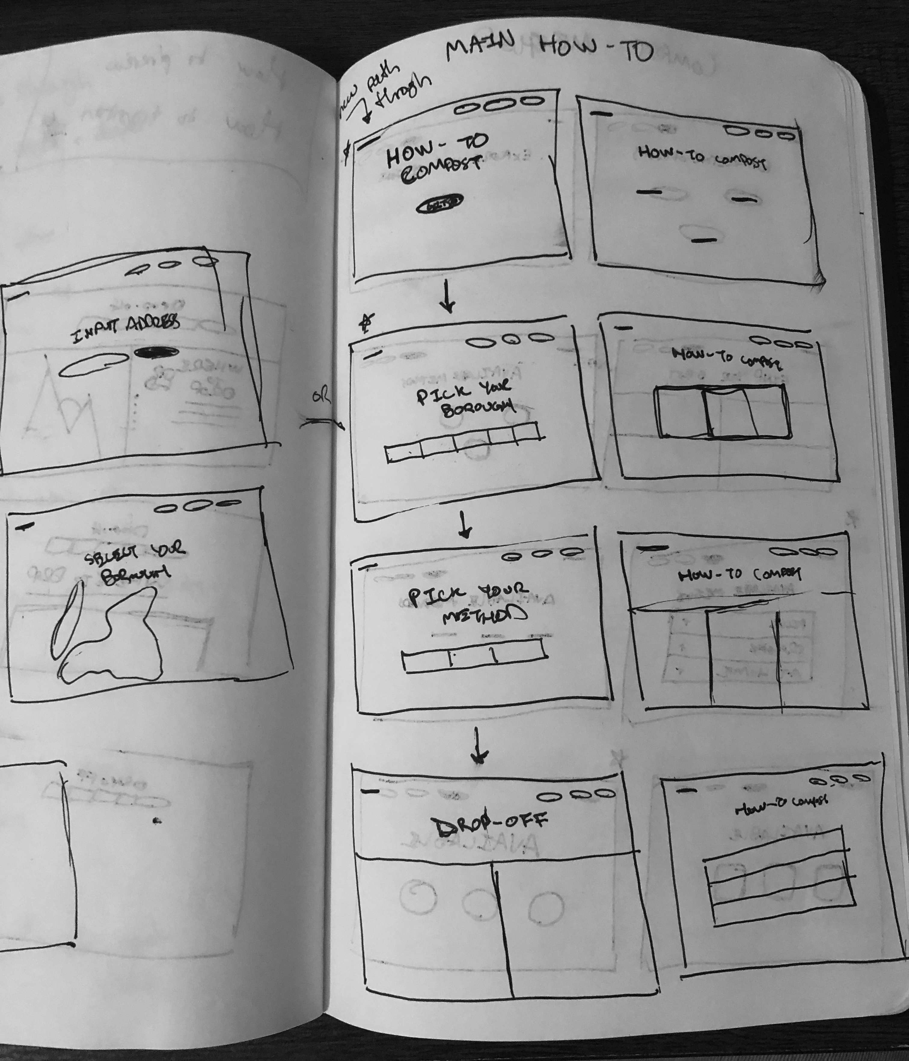
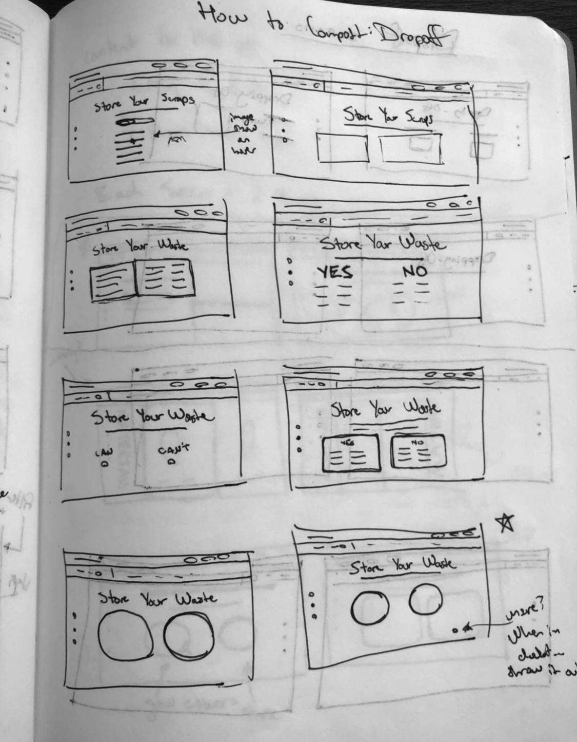
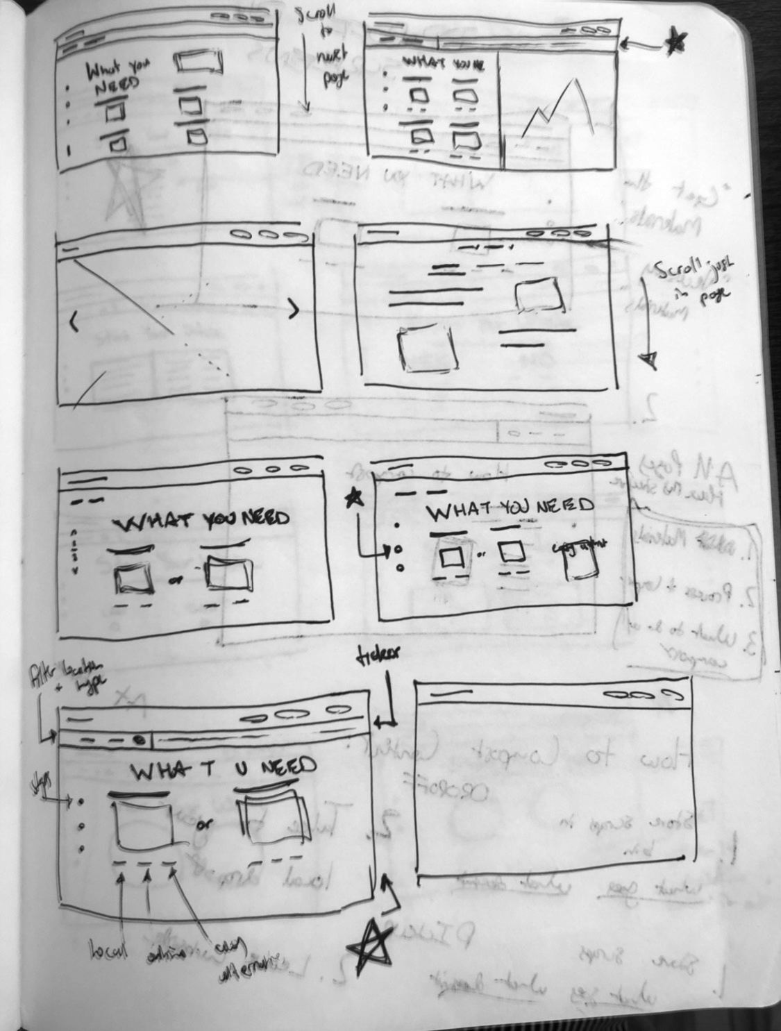
To work through several compositions for my pages in a quick and iterable format, I started with sketching. Here are just a few of countless pages of sketches—ranging in their fidelity. This helped me evaluate options and nail down the organization of content in a low-commitment, time-efficient way.
WIREFRAMING + PROTOTYPING
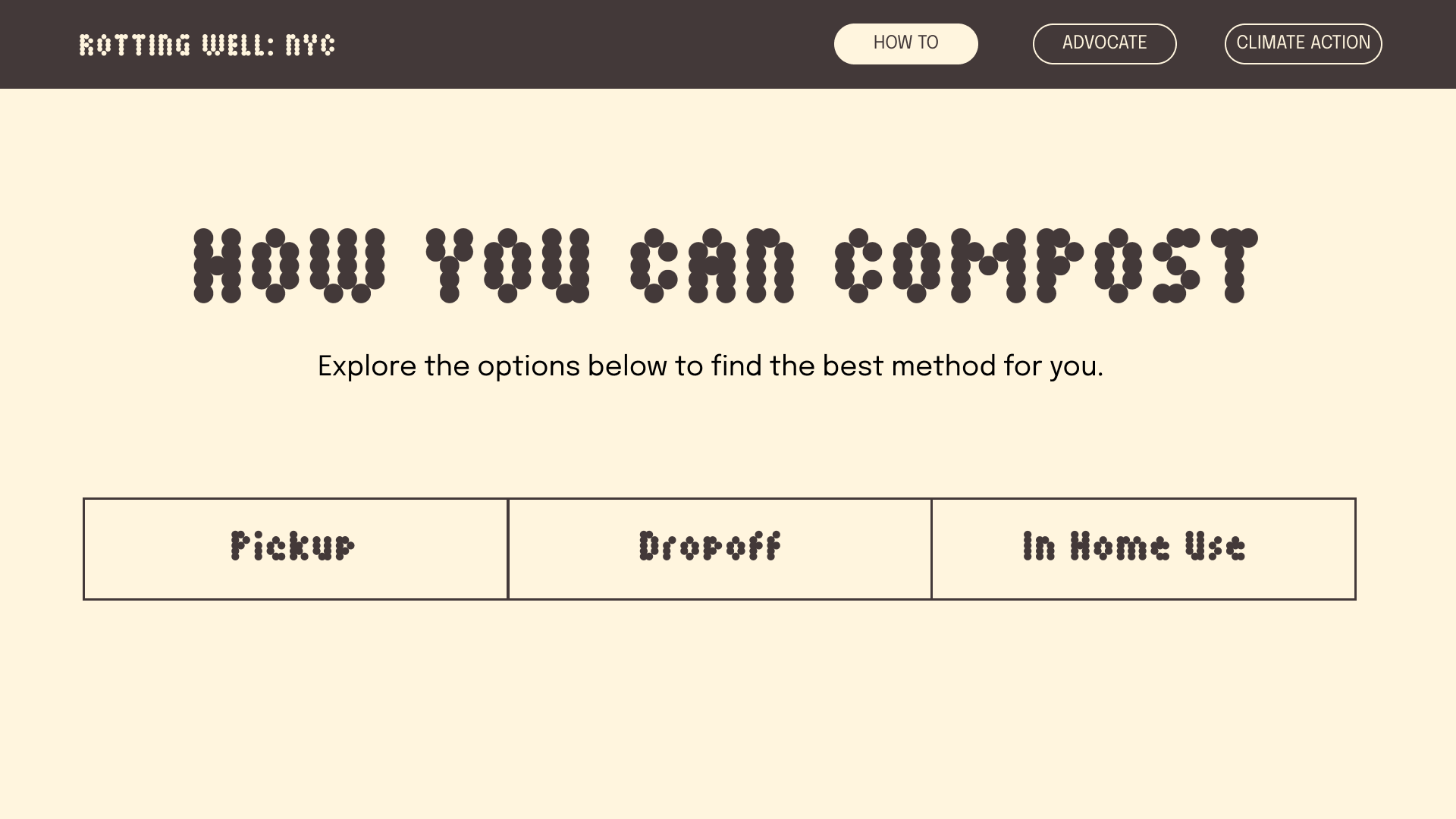
I then translated my lo-fi wireframes from my sketchbook to a higher fidelity version in Figma. This way I was able to build out some pseudo-interactions in addition to fleshing out the visual language.
USABILITY TESTING
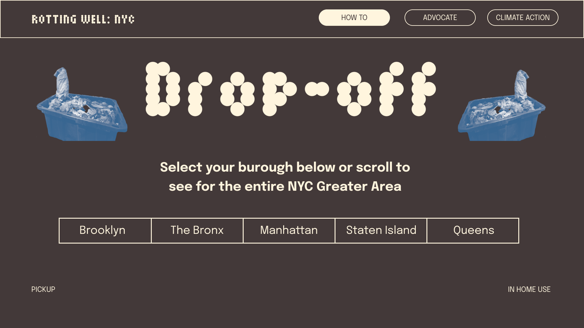
Once I had workable prototypes, I started to test my site’s usability, content structure, and general usability with a user in my target audience. My friend, who lives in Manhattan helped me by completing some A/B tests, think-aloud protocols, and retrospective probing during the process. One example of a direct impact was my subsequent choice to organize the flow by method of compost, rather than by borough.
DRAWBOT ANIMATIONS
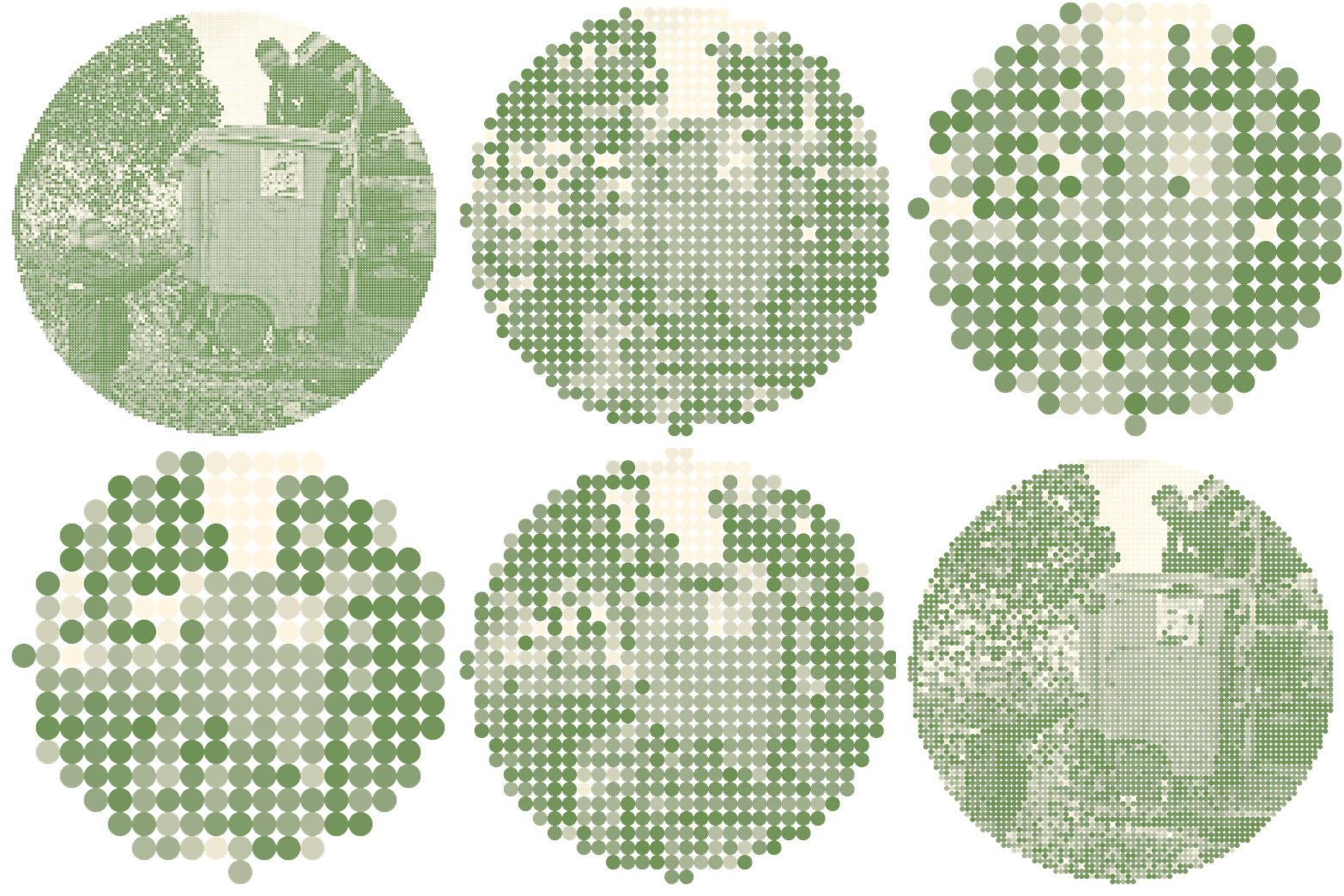
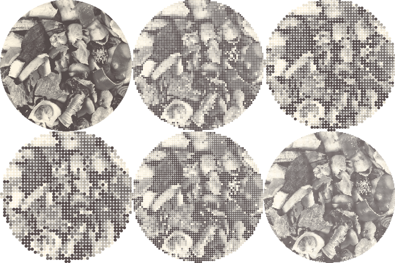
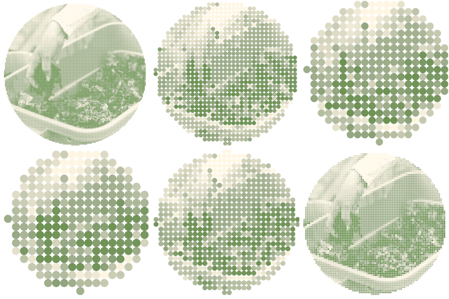
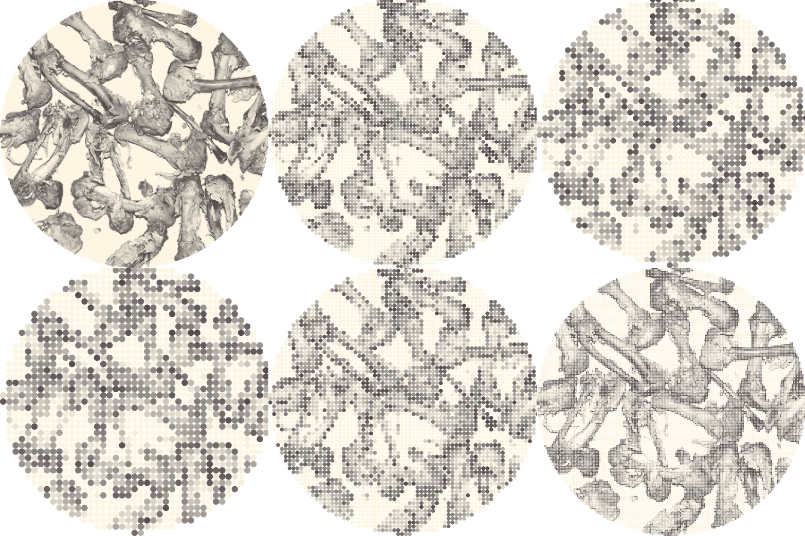
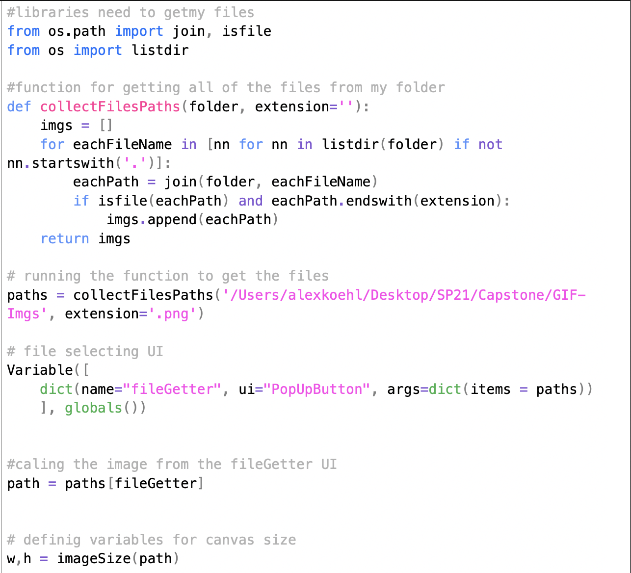

To visually represent the metaphor of decomposing food aiding in the growth of new, more nutrient-rich food, I programmed a tool in Drawbot. The tool creates a GIF of a selected image that animates a decomposing and recomposing loop of the image’s pixels. On the left are some of the GIFs I programmed, as well as snippets of my code for the animations and the file selecting UI addition.
FINAL SITE
Go check out the final product at rottingwellnyc.com!